When initially writing out the strategy statement and referring back to the brief I did some sketches.
I had seen this map previously as wrapping paper and it inspired my designing because it's not only appropriate style to the store but also relevant because the store is in the heart of Paris. I then incorporated this map into the designs for the promotion as a way to show the location of the store. I initially went with the idea of 'Merci to life' which is a phrase they have on there website. I then chose three pieces of promotion which would of be appropriate: mailout, lookbook and handout.
After coming back to this brief later on once i'd finished other briefs I then attempted to create some of my ideas. First I had to work out the two typefaces they use. By looking at the page source of the website I realised there logo is created from Helvetica Neue Bold.
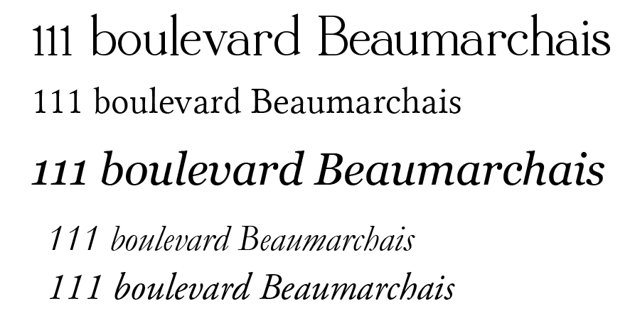
By trial and error I was able to work out that there serif typeface was Garamond Italic.
I then followed my initial sketches altering them slightly as I found that the type over the map wasn't very legible. The speech marks were initially a line but then to try and make the type stand out I altered this into a shape.
This idea of the speech marks had come from editorial design which is very fashion and stylish however this wasn't the impression I was getting from my attempt.
As an alternative I tried creating a location icon to mark the shop on the map as that is why I wanted to use the map.
Because the map was proving difficult to have text over the top and it's colouring conflicted with the branding palette I decided to try it in black and white.
I realised I was kind of going in circles and although it worked better and solved other problems, it wasn't really achieving anything.
It was at this point that I realised i'd rushed into digitally designing and hadn't really thought through my ideas yet. I hadn't created a concept in which to work on and because of this it was confused and unfocused in a direction and purpose.
Therefore I went back to the drawing board and evaluated what the store was from the strategy statement I had made and what the word 'merci' meant.
From this I decided to go with the statement of 'merci to life' but expand upon this and make it a concept. The word merci would go before everything such as merci to designers names or merci for coming etc. Simple yet I think it can work very effectively with the store attitude and style.
I then developed this idea and came up for a purpose of the promotion. I wanted to show how the concept could work across different promotional aspects of the store rather then 3 promotional formats for one objective. The three aspects i've chosen to promote are the exhibitions and event held throughout the year, hows theres something for everyone and the designers. These then I chose the best format for each which are a mail out invite, postcard/handout and a lookbook.


No comments:
Post a Comment