After my initial read through of the Brief Overview I did another read through picking out key words and phrases that stood out to me.
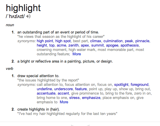
I then defined these words using google to extend the vocab and to create a visual understanding of what this could extend to. The word ethereal really stood out to me as not only is it what they described the exhibition design but also its very visual. The other word was parallel, I felt that this could work extremely well with the bilingual aspect of the identity as well as create a representation between fashion film and contemporary media.
I looked deeper into what parallel meant. There is a common diagram used which demonstrates parallel lines. This I felt was important and could work as a concept for the exhibition identity.
From this I looked at visuals under parallel, lines and angles.
I sketched ideas down from looking at what parallel was noting what it reflected in the exhibition and what it did mathematically. I also noted what the diagram was doing physically. This was then how I formed the idea the diagram being a representation of different aspects of the exhibition: fashion film (the new medium), contemporary media, and the featured designers.
The concept: The two parallel lines represent fashion film and contemporary media. The diagonal line which crosses across the two creating a join is the featured designers. The way the line hits across the two parallel lines creates an individual shape for the designer, a platform.
I also looked at how this could be used to create the overall identity of the exhibition such as the title. With it being two languages at one time the line could break, or slice, the text either both languages or combine both, one having the top of the line and the other below.
I found these images on slicing text.


No comments:
Post a Comment